Is Your Website Ready for Mobile Devices?

As more and more people move toward mobile devices to surf the web, connect with friends and find healthcare information, companies are working diligently to reach mobile users. In Q4 of 2013, 26.8% of Internet surfing was done via a mobile device, says Pew Internet Research. And that is up 8.5% from the year before. That increase is only going to continue to grow.
To help mobile users better navigate the web to receive the information THEY care about, companies are revamping their sites. There are three main ways to develop a site for mobile usage: mobile site, mobile friendly and mobile responsive.
Mobile Sites
This used to be the best way for mobile users to access websites. A mobile site is an abbreviated, simpler version of a company’s existing website. When users went to a website on their mobile devices, they would be redirected to a mobile-only site that presented a streamlined menu of four or five items that companies deemed to be most important to a viewer. In addition, these mobile sites tended to be devoid of any graphics, which is not an ideal customer experience. Graphics help further your brand through imagery and are key in developing consistency with your existing site.
The idea was that users wanted very limited information that was easy to download quickly. But as mobile devices became faster and more sophisticated , people began to expect more from their online mobile experiences. Users wanted the level of information they could find on a company’s full website, not just a few choices that were dictated to them. They wanted the sites to have all the information they needed and, to top it off, they wanted it to look good, too.
Today, mobile sites mostly frustrate users who encounter them. They don’t like looking for information that isn’t there and then having to redirect themselves to a desktop version that is too small to read. The end result is usually the user bouncing off the site. To meet the demand, companies had to shift.
Mobile-Friendly Sites
Then came mobile-friendly sites. These websites are identical to the desktop site, except they are scaled down to match the dimensions of the smart device. In theory, these are nice because you can get the full desktop experience. This worked for a while as an avenue to get more information to the consumer. The challenge with mobile-friendly sites is that on smartphones, the user must zoom in and move the screen around to read the content.
Mobile-friendly sites are often used by companies and dental practices alike. They are favored over mobile sites because the consumer can get all the information they need. The next challenge became ease of use. Can the user easily get that information? The consumer always wants more and is very demanding. Why not? They can be. Technology is constantly working hard to meet the growing demands of mobile users.
Therefore, to optimize the user experience, the concept of mobile-responsive was born.
Mobile-Responsive
Mobile-responsive websites are designed in three formats: for smartphones, tablets and desktops. The idea behind this is that the information will reorganize itself based on the device used so that it can be easily read and stay visible with a simple scroll of the finger. Less clicking on tiny menu items. Bigger content. A better overall experience, with all the information desired.
Notice that in mobile-responsive websites, there is MORE scrolling. Once, scrolling was thought to be taboo. People wanted less information on more pages. As people shift to today’s mobile devices, they naturally prefer to scroll. It’s an easier function that requires less specific clicking. So now scrolling is necessary!
While you will have scrolling on your site, it is important to balance this with your search engine optimization (SEO) strategies. SEO refers to how a site is optimized for a search on the Internet. Google measures how many page views a website receives. It uses this measurement as part of its search algorithm. So you need pages and you need lots of valuable and relevant content on those pages. Considering this, you have to balance scrolling with pages. Your web designer can help with this balance.
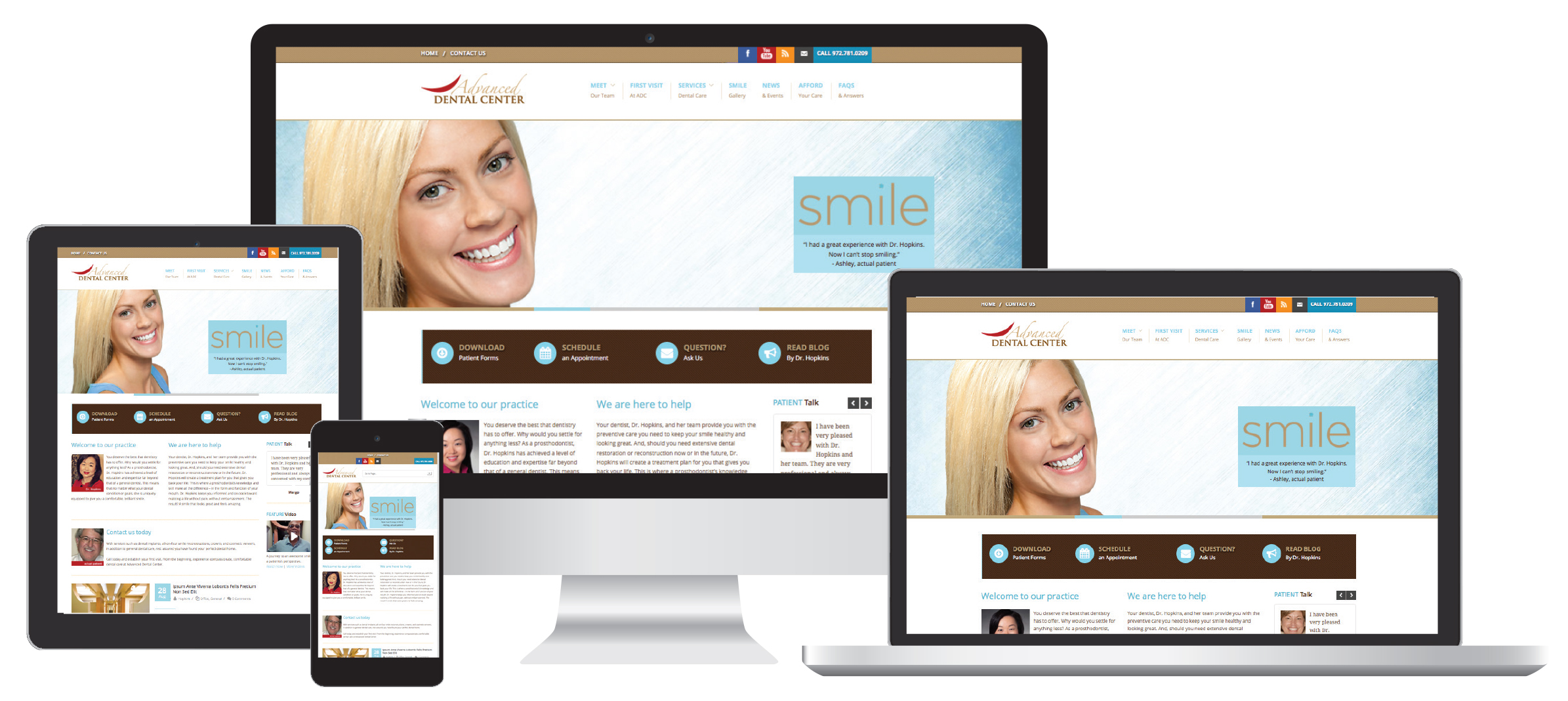
A Responsive Website Design creates a customized user experience for every device. It is one site that is designed to work on every type of device. Whether you’re on an iPhone, a tablet or a laptop, your viewer will see exactly what you want them to see, in the exact way you want them to see it.
Bottom line, you need a website that is forward-thinking. One that will deliver the website your patients expect when searching for you on their mobile devices.
Along with our partner, Jameson Management, Dentrix can help you build a website that successfully engages patients whether they’re using a desktop, tablet or smartphone. Learn more today.
Author: Misty Absher-Clark, Jameson Management
Published: 05/31/2014

 Contact Us
 Phone:
  Email
Email Request Demo